Towards Better Colors: Early Pilot Tests
“BEYOND THE ΔE DIMENSION”
Color targets, however good or useful they are, are not good indicators to chromatic reproduction of acquisition equipments. Human eyes suck at absolute colorimetric determination, and just by comparing charts like I’ve done in the previous reviews, do not speak enough about the depth and the range of the subjects.
All lens deviates from the “standard” RGB values, and sticking close to them do not say anything meaningful. I’ve seen shit optics, like $200 superzooms, being more on-target than expensive lenses considered “good in color,” Zeiss, Leica, what have you.
A less extreme example is on the right. The GM is a much superior lens to the ZA in many regards, including chromatic reproduction. But judging by ΔE values, it might deviate from target just as much.
The depth of color, much like depth to luminance, or otherwise exposure latitude, needs to be tested than the simple “representation” or color.
Testing a color chart against itself is just absurd as testing camera sensors against a standard, say 18% Gray target. It is no good representation of the depth, or latitude of exposure, and is no good indicator of image quality.
By “depth,” I really mean saturation.
If anything happens to the chromatic reproduction, the most saturated color takes the most hit, like losing highlight in post processes. You can test that out easily by playing around in DaVinci Resolve, and I will not spend too much time on explaining that. Light is an additive color system, meaning anything you add to the mix will pull the result towards white, and thus desaturating the image. The best optical systems, then, at least in terms of fidelity, will leave the most saturated bits of image untouched.
So, I devise, to use Vectorscope and Chromaticity charts instead of ΔE variance against charts to determine chroma attributes to a lens.
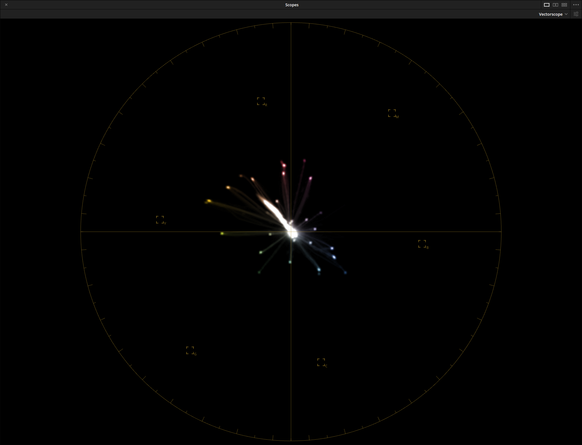
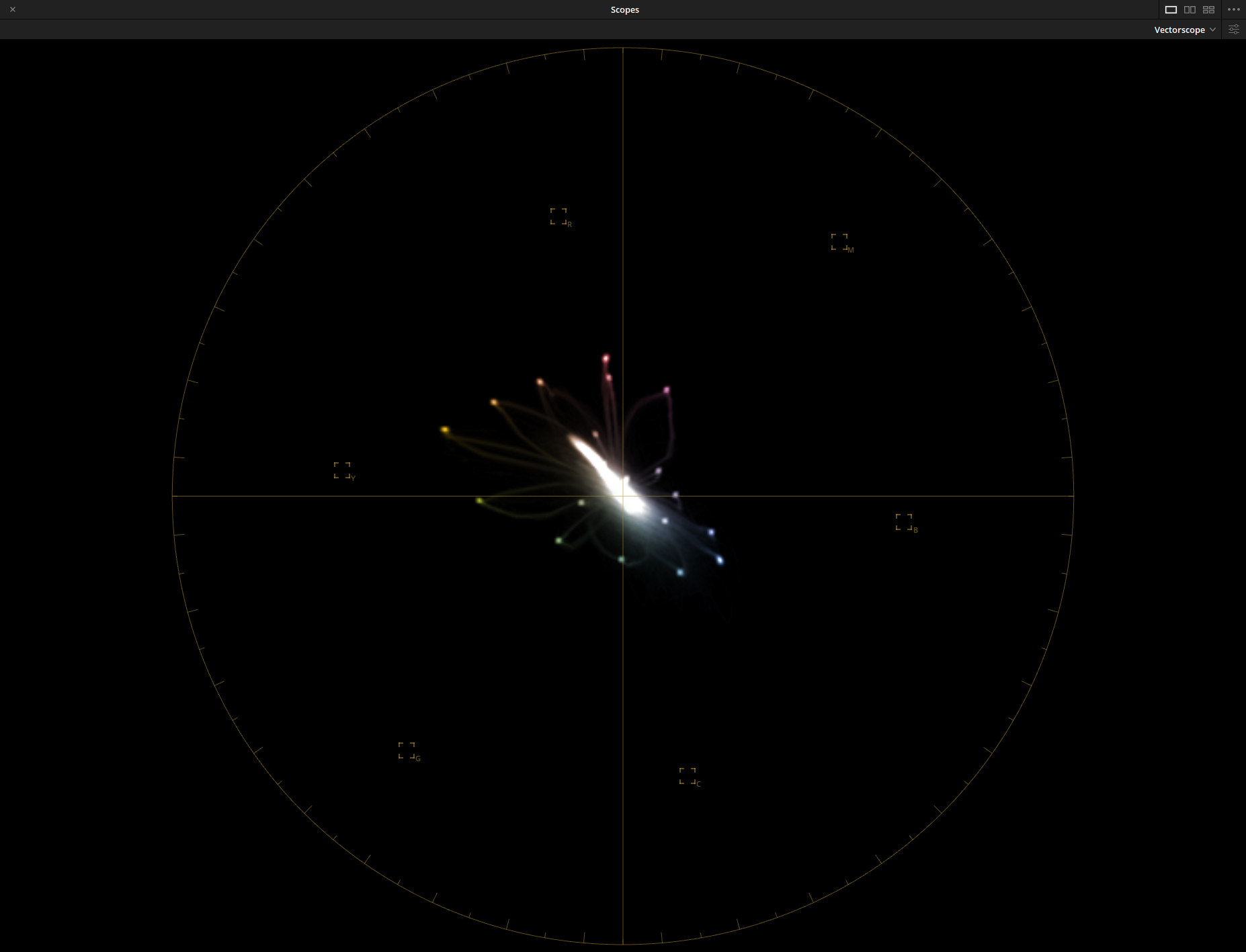
Above are the same color targets, but viewed in Vectorscope format.
I chose two lenses on each end of the spectrum, one critically acclaimed and one I know for sure sucked.
The test reveals. Not only the 50mm f/1.4 showed further-reaching tentacles away from the center, their ends are also brighter, indicating they hold more pixels there. Furthermore, the midtones (mid-saturations) are in beautiful straight lines, meaning they have little gradience over hue. That is good fidelity.
The second image, the 18-200mm, shows a much more undersaturated graph, especially among the magenta, green and cyan regions. its midtones are also spreaded towards the sides, creating a flower like pedal pattern. Visually they may be the same, if each pedal has the same degree of deviation with the same amount pixels, they will “add” to the same hue, but with lower saturation. When high saturation colors get crushed, they disperse away from the radial line connecting the center, taking in forms of less saturated, brighter colors with hue values on either side of the line. Exactly what we are seeing here. We can also see a greater spill near the center, likely due to coating issues or other forms of scattered rays.
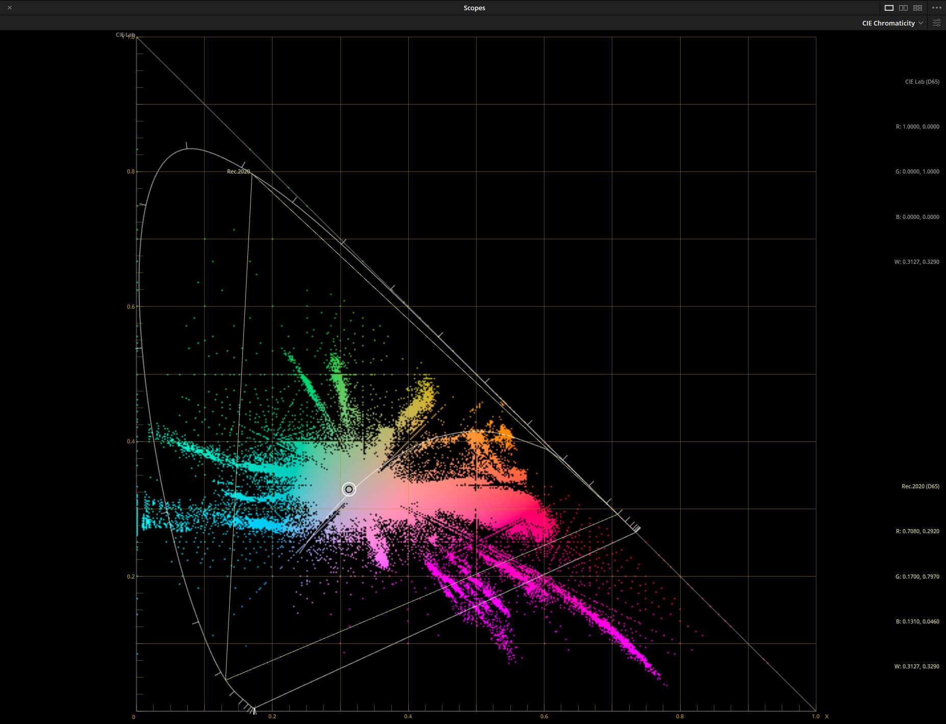
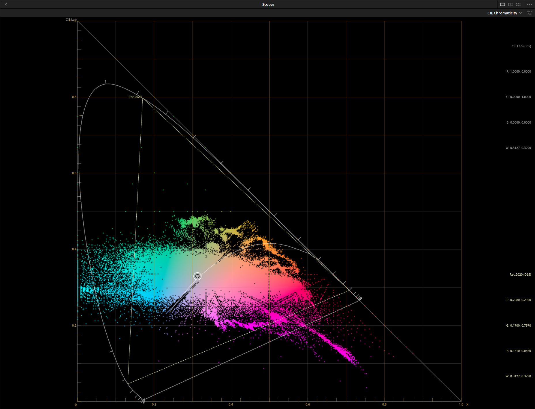
On the Chromaticity charts, this is once again proven true.
The 50mm f/1.4 showed cleanly formed fingers extending towards the edge regions, with blues and cyans actually peaking over what CIELAB could resolve. That is exactly why so many people, including myself, find the blues it reproduces so clean and pure.
The 18-200mm looked muddy, crushed and lacked in the magenta, cyan and green regions. It struggles on the blue primary, but the reproduction is not clean.
So what did we learn today?
In this piloting experiment, the hardware settings are completely unaltered. I used the same 24-patch color target and the same illumination (6500K Xenon flashes and high-CRI 5200K static LED), only test methods and post processes are changed. The key was to realize the depth, rather than a superficial representation of color needed to be investigated.
I sure hope this article will make you question the designs other reviewers (and my previous articles) used to determine chromatic reproduction.
Further improvements and investigations of the testing design may include richer sample selections. That would be easy enough to do. I also needed to look into the midtone spread of the hues, I’m not exactly satisfied of the above answer yet. I will update this article as soon as an explanation is reached.
Copyright © Wavechaser 2019-2020